Why Passport cover colors meaning varies around the world
Passport cover colors meaning seems simple at first glance, yet it hides layers of history, policy, and branding. Nations choose tones that are practical to print, resilient at borders, and symbolic at home. From caravan safe-conducts to biometric booklets, color traveled with paperwork and power. To see how travel systems long predate the jet age, explore the Silk Road trade network and how a Venetian traveler read imperial logistics in this Marco Polo biography. This guide explains why covers cluster around red, blue, green, and black—and why the story is about politics and standards, not superstition.
Historical Context
From safe-conducts to standardized booklets
Passports began as letters of protection and safe-conducts. Empires used seals, tablets, or tokens to speed trusted carriers along official roads. The Mongol yam relay added safe-conduct tablets and fast horses; travelers later described the system as a state-run express lane. That continuity matters when we look at today’s palettes. The paperwork evolved, but the need to verify identity at a glance never disappeared. In short, Passport cover colors meaning sits at the crossroads of visibility, authority, and routine. For a concrete view of relay logistics that once included early “passports,” see the institutional lens in Genghis Khan’s legacy and the bureaucratic consolidation under his successor in this Kublai Khan biography.
Color as state branding
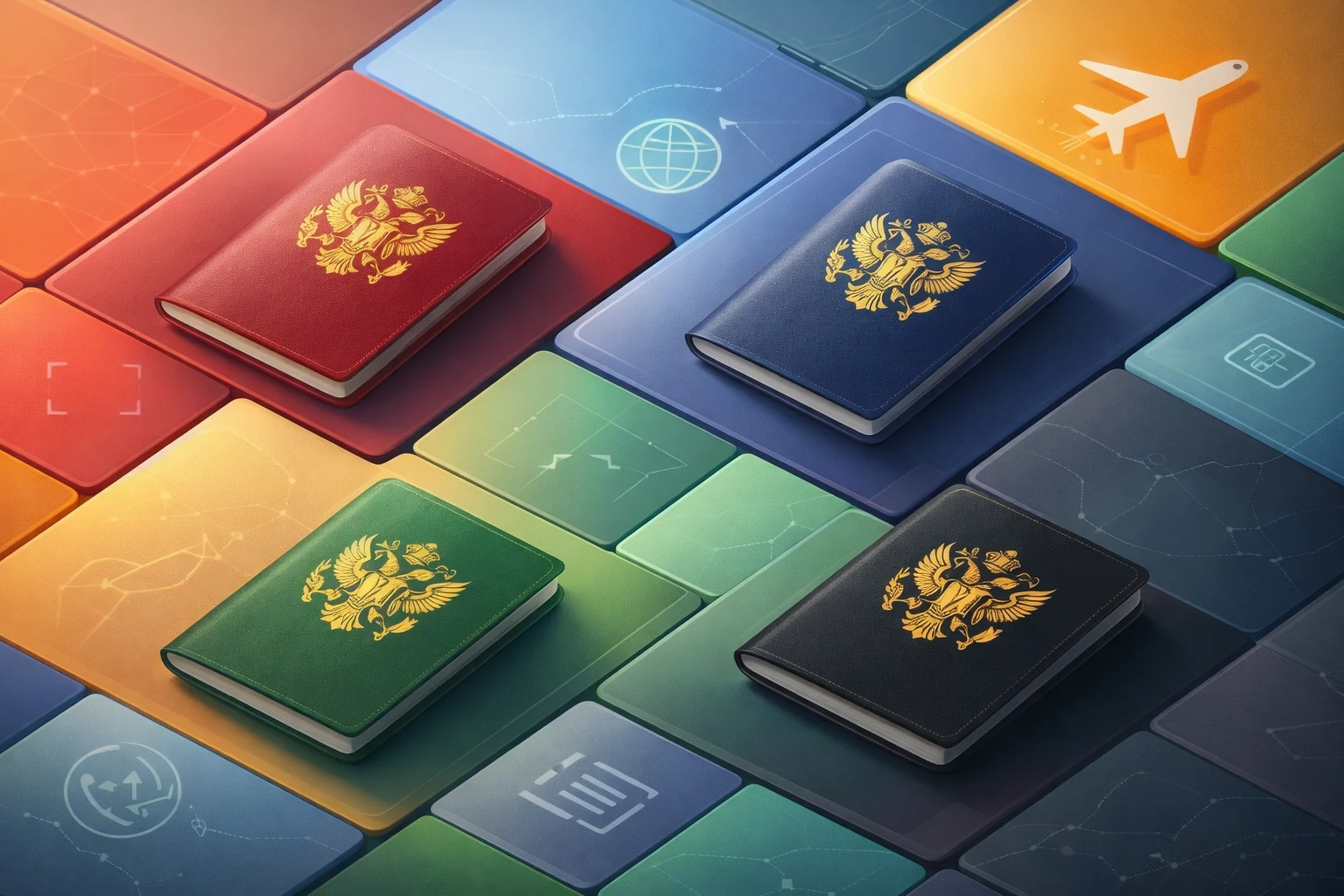
States long used color to signal identity. Courts chose dyes that were durable, legible, and symbolic. Borders amplify that logic: an officer must recognize a document quickly, in poor light, amid queues. Dark hues resist grime and wear, and gold foil contrasts well against them. Over time, clusters formed: burgundy across much of Europe, blues across the Americas and the Pacific, greens in many Islamic-majority countries, and black where a stark, official look was preferred. Those clusters reflect alliances, supply chains, and administrative taste as much as heritage.
Key Facts and Eyewitness Sources
What the rules actually standardize
There is no global rule that dictates a cover color. International standards focus on size, page layout, machine-readable zones, and security features. The definitive reference is ICAO’s Doc 9303 on Machine Readable Travel Documents. It specifies interoperable formats for booklet size (ID-3), the MRZ, and features like chips and photos—not the cover hue. That distinction explains why governments can tune the look while staying fully compliant. For the technical backbone, see ICAO Doc 9303 (Part 3) specifications. Understanding this line between function and style clarifies Passport cover colors meaning in practice: standards carry the security; color carries the signal.
Regional harmonization exists—but it’s political, not physics
Where we do see a strong palette, it’s usually by political choice. The European Communities adopted a uniform passport design in the 1980s that recommended a burgundy cover; member states implemented it over time. This was branding and convenience, not a biometric necessity. The wording and layout evolved, but the color became the visual shorthand of EU citizenship across counters worldwide. The original framework is recorded in the 1981 Council Resolution on a uniform passport. Elsewhere, groups harmonized less formally: Caribbean states favored dark blue; the Andean Community leaned red for a while. In all cases, the story is coordination and optics more than chemistry.
Analysis / Implications
Color works like a flag at the counter
Think of a passport cover as a micro-flag. It sets expectations before the data page is even opened. Burgundy suggests European harmonization; navy blue often signals the Americas; green evokes religious or cultural heritage in several regions; black can connote ceremony or distinctiveness. These are conventions, not algorithms. A country can change its tone to mark a political pivot, a rebrand, or a supply switch. Because border work is fast and repetitive, color reduces friction. That’s the practical heart of Passport cover colors meaning: fast categorization that never replaces the official checks but speeds the dance that leads to them.
Design trade-offs: durability, legibility, and supply chains
Dark covers hide scuffs, keep foil titles readable, and age consistently across batches. Pigment availability and anti-counterfeit foils favor certain shades. Printers and substrate suppliers carry standard inks and laminates, which makes mass production cheaper and faster. That’s why outliers exist but clusters persist. Color also has to work with embossed coats of arms and the biometric chip logo. As materials shift—polycarbonate data pages, recycled substrates—expect procurement logic to press for reliable inks and foils over exotic hues.
Case Studies and Key Examples
Europe’s burgundy play
Most EU members followed the 1980s move toward burgundy covers. The choice created instant visual unity without rewriting the technical core set by ICAO. It also survived later upgrades, like biometric chips and revised field numbering. The motive was recognizability and shared identity at global counters. The policy lesson: blocs use color to brand cooperation while outsourcing pure security to standards.
Blue clusters and the “Atlantic look”
Many countries in the Americas and Pacific use navy or deep blue. The shade reads official, pairs well with gold foil, and prints reliably across vendors. When a state changes alliances or branding, the cover can follow—without touching the MRZ or chip. That balance keeps queues moving and politics visible. It’s why Passport cover colors meaning can shift with elections or treaties yet still scan at the gate.
Green, black, and deliberate distinctiveness
Several Islamic-majority states use green, a culturally resonant color. Some African and island states have adopted black for contrast and gravitas. In each case, the palette communicates tradition or uniqueness while remaining within ICAO’s technical guardrails. When critics ask whether meaning is “real,” the answer is pragmatic: color guides human attention; security lives in the substrate, the MRZ, and the chip.
Case Studies and Key Examples
How earlier paperwork shaped today’s look
Administrative culture leaves fingerprints on documents. Clay seals, wax impressions, and stamped tablets made authority legible at distance. That habit flows forward into passports, where the coat of arms and foil typeface carry as much symbolic weight as the hue itself. For deep roots in early states and record-keeping, see this wide-angle look at Mesopotamia’s administrative world.
“Roads” that taught governments to brand documents
Relay networks forced officials to think about trust at speed. The Mongol system standardized signals across vast ranges; what we call a “passport” today echoes that logic. For how empires scaled identity checks alongside trade, compare the Mongol relay story and the maritime turn that followed overland zeniths. The thread is continuity: paper and color say “let this bearer pass,” then the machine proves it. The lesson applies at modern counters and e-gates alike.
Explorers, borders, and the psychology of a booklet
Travelers once crossed by letter and seal; explorers later navigated customs with printed papers. Modern tourists still feel the theater of presentation—booklet in hand, foil glinting under glass. The cover color primes expectations, but the data page settles the matter. For a narrative of long-distance movement shaping identity, see this Vikings exploration timeline, which shows how mobility rewires norms and symbols.
Practical Takeaways for Readers
Meaning you can trust—versus meaning you should ignore
Trust the meaning that repeats across governments: groups harmonize colors to say “we belong together,” or a country picks a shade to echo heritage. Ignore pseudo-rules that claim a hue alone changes your rights. Those live in law, not in pigment. Functionally, ICAO sets how passports work; cover color sets how they look. Keep that split in mind whenever Passport cover colors meaning pops up in trivia lists or viral posts.
Why outliers and switches happen
Supply contracts, anti-counterfeit updates, and politics can trigger changes. A government might revert to a historic shade, align with a bloc, or spotlight a centenary design. None of that breaks interoperability when specifications stay inside Doc 9303. If you notice a new tone at renewal, assume procurement plus branding, not new border powers. That’s the quiet stability built into modern document standards.
Conclusion
Cover colors live where culture meets convention. Burgundy across Europe, blues across the Atlantic world, greens in Islamic contexts, and blacks where formality sells—all communicate quickly without touching the cryptography, biometrics, or data fields that do the heavy lifting. The palette tells a story; the passport still proves identity. If you want to see how states survive by standardizing signals while adapting systems, read this study of Byzantine resilience, and for how a single shock can pivot regional rules and symbols, revisit the Fall of Constantinople investigation. In that light, Passport cover colors meaning is not a secret code—it’s a shared language layered on top of robust, global standards.